
Design Tokens in 2026: How to Synchronise Figma and the Production Interface Without Manual Fixes
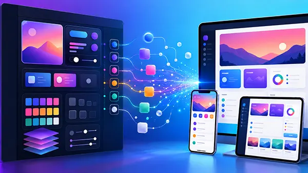
A design system becomes difficult to maintain when the same decision exists in several disconnected places. A brand colour may have one hexadecimal value in Figma, another in CSS and an older version inside a mobile application. The same problem can affect spacing, border radii, typography and component states. Design tokens reduce this duplication by giving important design decisions stable names and reusable values. In 2026, the connection between design and production is considerably more practical than it was a few years ago: Figma variables can represent tokens, the Design Tokens Community Group has released its first stable specification, and token files can move between design and development workflows in standardised formats. The goal is not to remove designers or developers from the process. It is to stop them repeatedly copying values between tools and correcting predictable inconsistencies by hand.
Why Design Tokens Have Become the Link Between Figma and Production
A design token is a named design decision rather than simply a stored colour or number. Instead of telling a developer that a button uses #2563EB, for example, a design system can define a primitive colour and then reference it through a semantic token such as colour/action/primary. The distinction matters because the semantic name describes why the value is being used. If the brand colour changes later, the team can update the underlying token rather than searching through hundreds of frames, components and style sheets for an old hexadecimal code. The same approach works for spacing, dimensions, typography-related values, borders and many other recurring decisions.
Figma variables provide a practical design-side representation of this model. Figma currently supports colour, number, string and boolean variables, while variables can also reference other variables. This makes it possible to separate raw values from the decisions that use them. A blue value can sit in a primitive collection while interface elements refer to semantic variables such as text/link/default or background/action/primary. Figma also supports modes, allowing the value behind a variable to change according to context. Light and dark themes are the obvious example, but modes can also represent different brands, device sizes or other controlled variations without requiring a separate set of components for each case.
The major change for 2026 is that token exchange no longer has to depend entirely on proprietary conventions. The Design Tokens Community Group published its first stable specification, version 2025.10, on 28 October 2025. Figma subsequently introduced native design-token import and export based on the DTCG format. A team can therefore keep token data in structured JSON rather than inventing a different format for every tool in its workflow. This does not make synchronisation automatic by itself, but it gives designers and developers a common vocabulary. Instead of translating design decisions every time work changes hands, both sides can work from the same named values and relationships.
Build a Token Structure That Both Designers and Developers Understand
The most reliable token structures normally have more than one level. Primitive tokens store basic values such as colour/blue/500, spacing/16 or radius/8. Semantic tokens explain the purpose of those values, with names such as colour/text/primary, colour/background/surface or spacing/component/medium. Component-specific tokens can be added when a component genuinely needs its own controlled decision, such as button/background/primary/default. This structure prevents the design system from becoming a list of hundreds of unrelated values. More importantly, it allows a visual change to move through the system predictably: a primitive can change while semantic and component references remain intact.
Naming is therefore more important than it may initially appear. Names based only on appearance tend to age badly. A token called blue-button may become misleading after a rebrand turns the button green, while action-primary can remain accurate. The same principle applies to spacing and typography. Names should describe purpose wherever possible and should follow one convention in Figma and code. If Figma uses colour/background/primary while the codebase calls the equivalent value mainBlueBackground, synchronisation still leaves developers translating concepts manually. Establishing the vocabulary before creating hundreds of variables is usually cheaper than renaming an established system later.
Modes should also represent genuine variations rather than act as a place to store unrelated alternatives. A light mode and dark mode can hold different values for the same semantic background or text variable because the meaning remains the same while the context changes. Figma can import DTCG-formatted JSON files as modes, and when several files are imported into a new collection, each eligible file can create a mode. Teams should pay attention to naming during this process because Figma normalises nested token names with forward slashes, and conflicting names can cause duplicate tokens to be ignored during import. A short naming policy covering hierarchy, capitalisation, abbreviations and deprecated tokens prevents many avoidable problems.
Creating a Controlled Figma-to-Code Synchronisation Workflow
The first operational decision is to choose where approved token changes originate. Some teams prefer a code-first model in which token JSON files stored with the codebase are the authoritative record and approved changes are imported into Figma. Others allow design-system maintainers to author variables in Figma and then export or synchronise them into the development repository. Either model can work. Problems appear when both Figma and code are treated as independent authorities and people are allowed to change the same token on either side without a reconciliation process. A clear owner and a documented direction of travel are more valuable than an elaborate toolchain with ambiguous responsibility.
For many teams, a practical 2026 workflow starts with DTCG-compatible token files under version control. A proposed change receives the same review discipline as other shared product assets: the author changes a token, the difference is visible in the change history, reviewers check the effect, and the approved version is used to update the required outputs. Figma’s native token import can then update matching variables and modes without requiring a designer to edit every value manually. If Figma is the authoring side, exported token data can follow the opposite route. Version control adds an important safety net because the team can see exactly what changed and restore a previous state when an update produces an unintended result.
Larger organisations can automate more of this process with Figma’s Variables REST API. The API supports reading, creating, updating and deleting variables and is specifically documented for workflows that connect Figma with continuous integration systems or a design-system source of truth. Access to the Variables REST API is currently subject to Figma Enterprise requirements, so it should not be presented as a universal solution for every team. Smaller organisations can still build a useful process around native import and export, approved token files and suitable plugins. The important point is that routine value transfer should follow a repeatable process rather than depend on someone remembering to copy a new colour or spacing value into several separate locations.
Turn Shared Tokens into Production Values Instead of Copying Them by Hand
Once an approved token file exists, the development side needs a repeatable way to turn it into values the application can consume. Tools such as Style Dictionary are commonly used for this purpose because they can transform a central token collection into outputs suitable for CSS, JavaScript, iOS, Android and other development targets. Style Dictionary supports the DTCG approach, although teams using newer or more specialised parts of the 2025.10 specification should check the current compatibility notes before committing to them. For a typical colour, spacing and typography system, the principle remains straightforward: maintain the decision once and generate the representations needed by each product rather than maintaining parallel lists manually.
Consider a change to a semantic token named colour/background/brand. In an unsynchronised workflow, a designer changes the colour in Figma, sends a message to a developer, the developer searches for the corresponding CSS value, another developer updates the mobile application, and someone later notices that a hover state still uses the previous colour. With shared tokens, the approved value changes at its source, references continue to point to the same semantic name, and generated code receives the updated value during the normal build process. Review is still necessary, especially for accessibility and unexpected visual effects, but the repetitive transfer of the value disappears.
Figma’s Dev Mode helps maintain this connection during handoff. Developers inspecting a variable can see its name, collection, active mode, resolved value and alias chain, rather than receiving only the final raw value. Figma also allows code syntax to be associated with variables, with current snippets supporting CSS, SwiftUI and Compose. A developer can therefore see that an element uses an agreed design-system variable instead of treating every inspected value as an isolated instruction. This is particularly useful during code review: a hardcoded colour such as #1F2937 can be questioned when the component should be using the established text token, making drift easier to identify before it becomes part of the released interface.

Preventing Manual Fixes Requires Governance as Well as Automation
Token synchronisation fails when teams concentrate on exporting values but ignore how those values are created and changed. Not every measurement in a Figma file should become a token. If designers create a new variable for every slightly different margin, colour or radius, the token library quickly becomes harder to understand than the raw values it replaced. A useful test is whether the decision is repeated, meaningful or expected to change as part of the system. A recurring surface colour deserves a token; a one-off illustration coordinate probably does not. Keeping the collection intentional makes it easier for designers to select the correct variable and for developers to trust the generated output.
Changes also need ownership. A mature workflow identifies who can add a new token, who approves changes to existing semantic values and what happens when a token is no longer needed. Renaming or deleting an established token can affect many components even when its visual value does not change. Deprecation is usually safer than immediate deletion: mark the old token as obsolete, provide the replacement, migrate consumers and remove it only after usage has been checked. Change records should explain the purpose of significant updates rather than simply stating that a value moved from one hexadecimal code to another. This gives both design and engineering teams enough context to judge whether a modification is intentional.
Automated checks can deal with predictable errors before visual review begins. A token file can be checked for invalid syntax, duplicate names, missing references, inconsistent types or unexpected hardcoded values. Visual and accessibility checks should then cover the effects that token validation cannot judge on its own. Changing a text or background token, for example, can alter colour contrast across many components at once. A successful build therefore does not prove that a design change is suitable. Automation should remove repetitive verification so that people can spend their review time on usability, hierarchy, accessibility and product context rather than comparing lists of colour codes.
A Practical Adoption Plan for Existing Design Systems in 2026
An existing product does not need to convert every design decision into tokens at once. A safer first stage is an audit of the values already repeated across Figma and production. Colours are often the easiest starting point because inconsistencies are visible and semantic roles such as text, surface, border, action and status can usually be identified. Spacing, radii and typography can follow once the team has tested its naming rules. During the audit, repeated hardcoded values should be mapped to proposed primitives and semantic tokens. Values that appear similar but serve different purposes should not automatically be merged simply because their current numbers happen to match.
The next stage is a limited production trial. One component family or one clearly defined part of the interface can use the new tokens from design through to released code. The team can then check practical questions that are difficult to answer in a theoretical specification: do designers understand the names, can developers find the correct tokens in Dev Mode, do dark-mode values resolve correctly, does the code-generation process produce readable names, and can an old token be replaced without creating hidden breakage? Once these questions have clear answers, the same workflow can be expanded to additional components. This incremental approach also makes it easier to remove obsolete local styles instead of maintaining two systems indefinitely.
Success should be measured by the amount of drift the workflow removes, not by the number of tokens created. Useful indicators include fewer hardcoded design-system values in production, fewer discrepancies between Figma and released components, shorter time between an approved token change and its implementation, and fewer manual corrections during design review. Figma itself continued reducing the distance between design and code in 2026: a July update brought auto layout behaviour closer to CSS, while another July update allowed code-backed screens brought onto the canvas to bind colours, type and spacing to many variables already present in the file. These improvements reinforce the direction of travel, but a dependable token system still depends on clear naming, ownership, controlled changes and automated validation. When those foundations are in place, Figma and production can share design decisions instead of repeatedly recreating them.