How to choose colors for the application?
In the world of app design, color schemes play a pivotal role in shaping user experience, driving brand identity, and enhancing app friendliness. This article delves into color distribution methods, the impact of colors on a brand, and the psychology behind color perception.
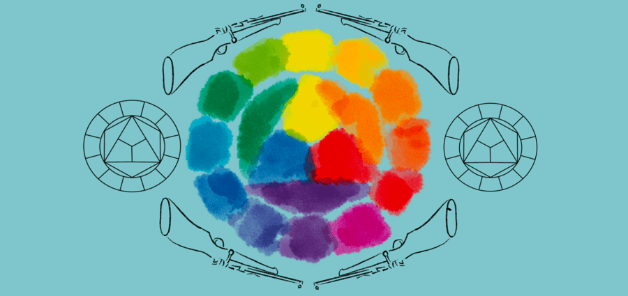
The Science of Color Distribution
When it comes to distributing colors in app design, there are several popular methods:
- Monochromatic: Utilizes different shades, tones, and tints within a particular hue.
- Analogous: Combines colors that are next to each other on the color wheel.
- Complementary: Involves two colors that are directly opposite each other on the color wheel.
- Split-Complementary: Uses a base color and two colors adjacent to its complement.
- Triadic: Involves three colors that are evenly spaced on the color wheel.
- Tetradic: Employs four colors that consist of two sets of complementary colors.
The Influence of Colors on Branding
Colours have a significant power over brand perception. They play an important role in conveying brand personality, stimulating emotions and evoking certain associations in the user’s mind. For example, blue often signifies trust and professionalism, while gold, as in a casino, signifies luxury and freshness.
The color scheme you select for your app can either enhance or undermine the brand image you wish to project. Therefore, choosing colors that align with your brand values and audience expectations is paramount.
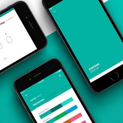
The Art of Choosing the Right Color Palette
Selecting the right color palette for your app involves considering several factors:
- Brand Identity: Align the color palette with the brand’s personality and values.
- Audience Preferences: Understand your target audience’s demographics and psychographics to choose colors they find appealing.
- Industry Standards: Consider colors commonly used in your sector. For instance, financial apps often use blue to symbolize trust and stability.
- Accessibility: Ensure your color choices are accessible to all users, including those with color vision deficiencies.
The Psychology and Perception of Colors
Each color has a different psychological impact:
- Red: Evokes strong emotions, energy, passion, and urgency.
- Blue: Represents trust, security, and productivity.
- Yellow: Symbolizes happiness, optimism, and friendliness.
- Green: Associated with growth, balance, and nature.
- Purple: Conveys luxury, creativity, and mystery.
- Orange: Represents enthusiasm, excitement, and warmth.
Gender can also affect color perception. While generalizations can be overly simplistic, research indicates that men often prefer bold colors, while women might lean towards softer hues. However, individual preferences can vary significantly, so it’s vital to understand your specific user base.
The Power of Color in App Design
Colors are more than just decorative elements in app design; they are a potent tool for enhancing user experience, promoting brand identity, and boosting app friendliness. By understanding color distribution methods, the impact of colors on branding, and the psychological implications of color choices, you can create an app that resonates with your users and stands out in the competitive app market.